I’ve said it before (perhaps more than once), but for me, a good fashion film is one which approaches the tenets of gorgeous clothes, on stunning models, in breathtaking locations, from a hitherto unseen perspective or in an unquestionably entertaining manner. Which is why I felt an instant attraction to Crowns & Owls’ Wonders Never Cease – a playful story of professional oneupmanship set amongst the magnificent halls and corridors of London’s Natural History Museum. Crowns & Owls join us to discuss how the evolution of their relationship with fashion brand Ted Baker fuelled the visual and narrative ambitions of their collaboration.
This isn’t the first film you’ve made for Ted Baker. What established that collaborative partnership and how has it grown over the projects you’ve made together?
We started working with Ted Baker about 2 years ago now. Film was less of a priority for the brand then and they hadn’t really experimented too heavily with the medium in previous seasons. We had spent a few years trying to make cinematic music videos and low budget internet commercials so that tone of voice was pretty ingrained in our work, so when we were asked to shoot for Ted we tried to bring some of the world we’d been working in to theirs. Over each season the brand has given increasing priority to the moving image side of things and with that we’ve tried to be more and more ambitious and ultimately challenge ourself.
The narrative feels irrevocably linked to the Natural History Museum. Was this written around that location? How did the archaeological one-upmanship concept mature into the final film?
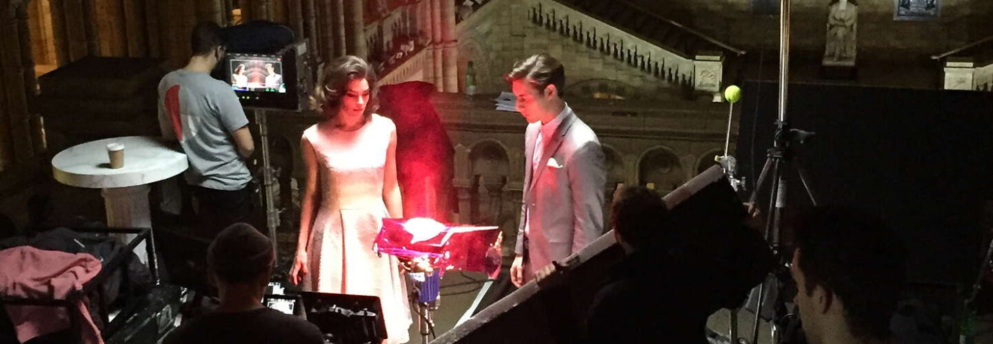
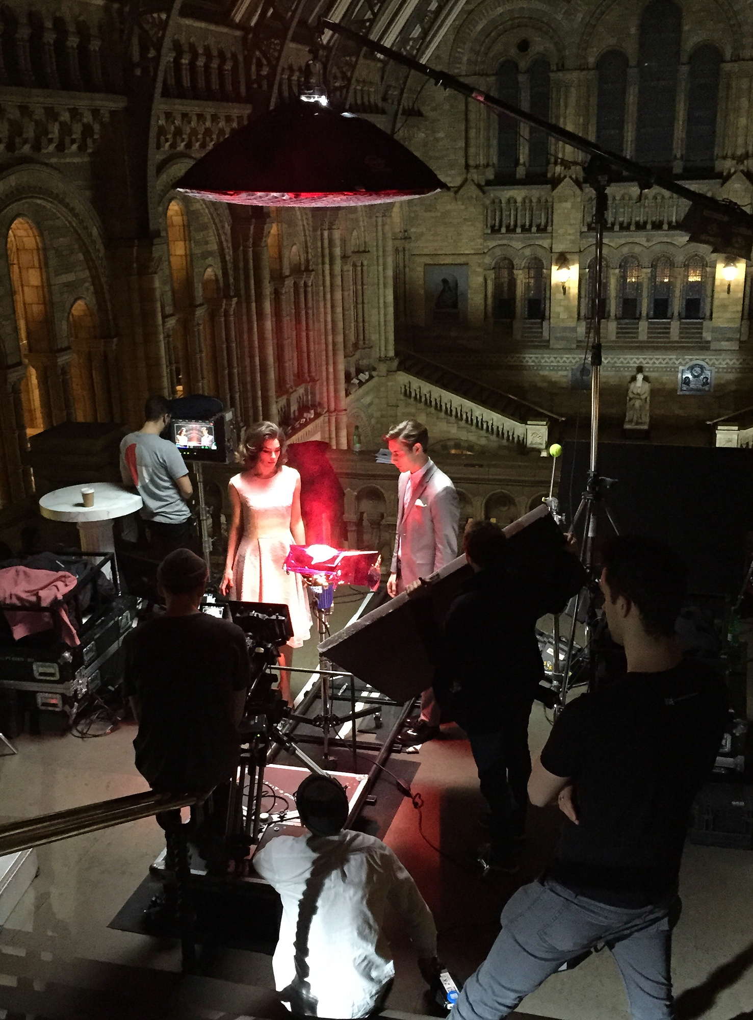
The story was very much crafted around the location. The brand chooses where it wants to set each campaign for its stills and we craft our narratives around that space. A lot of people don’t realise we are sharing the set with a stills photography team. Between our shots the models go off and get changed into a different look for a stills shot and it goes back and forth like that. It’s an interesting way of working and you have to be very strategic as time is obviously of the essence as both parties have their separate briefs to achieve. The rivalry aspect slowly cooked for a little while – we know we’re always going to have a male and female character so we wanted to experiment with their relationship rather than doing a hide and seek piece without much character. The museum is a totally breathtaking location, and the building embodies the age of discovery so well. Artefacts are an obvious element within that context, but the idea of the two rivals finding the same specimen actually arrived quite a while into the writing process. The hardest part was working out how we conveyed the characters’ realisation that they are both in possession of opposite halves of the same piece. That came very late…a little too close for comfort really…the pencil break was our saviour.
That came very late…a little too close for comfort really…the pencil break was our saviour.
There can be a worry of ‘telling not showing’ when a film relies on voiceover for progression. How did you mitigate falling into a didactic voiceover trap?
We were definitely concerned about the “on the nose” nature of the voiceover. To us, we had to ensure we could shoot a film that would translate pictorially from the offset for several reasons. The main reason is an obvious one – telling and not showing is generally pretty lazy filmmaking. There was also the massive parameter that is established by shooting for a brand that is extremely global – we couldn’t rely on the English language to tell the story for us. Avoiding that was interesting – for us it was about injecting a slight bit of theatricism into the performances so that the intentions of the character ring a little clearer. It’s ultimately a pretty visual story so it was just a case of pacing everything right so that viewers could slowly digest the beats in the narrative.
 Across the board the design of Wonders Never Cease is simply gorgeous. How was that driven by the palette of the Autumn/Winter collection?
With the collection being for Autumn/Winter, richer, deeper colours tend to be a given, so naturally they complimented the palette of the museum well with its golden tones. We selected the looks for the film that we knew would “pop” within the environment of certain scenes. For this piece we tried to keep the changes of the looks as minimal as possible within scenes – implying that each new look is a new day and therefore sits within the world of cinema a little more rather than fashion film.
I love the way you use the architecture to play the rivals off against each other spatially throughout.
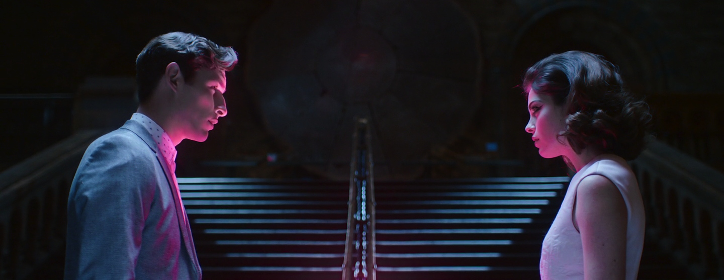
To us, the cinematography had to reflect the balance of the characters – they are a perfect match and that’s ultimately what stirs their initial rivalry and bitterness towards one another. The architecture of the museum is laden in symmetry and we tried to use this to convey the equal prominence and power of the lead characters, allowing them to balance the frames.
How did equipment choices contribute to the overall style?
We wanted to give the museum an unspecifically older feel as 2015 doesn’t really feel like an age of discovery. Whilst the key to this was mainly in the art direction, shooting on uncoated primes helped us to achieve this look – they give a slight ambience to the highlights which evokes that classier vintage tone.
I’ve read suggestions of “Wes Anderson inspired” in some of the comments for Wonders Never Cease. What influences did you draw from?
The three of us are definitely fans of Wes and have been for a long time – but he wasn’t really at the forefront of our minds from a cinematography perspective. As we talked about earlier, balance was key and we’d experimented with a lot of the distinctive camera moves in our other work – for example, we love pushing into characters during moments of conflict and tension and have used that since our first projects. Wonders was kind of the product of those two elements colliding at the head. We definitely nodded to Wes in some of our action – synchronised movement sets a certain whimsical tone which is definitely apt for the universe of the brand. We have another piece due out soon which couldn’t be further from the feel of Wonders but definitely has evidence of similar techniques being used – we try and mix them with the visual language we’ve been trying to refine for ourselves since the beginning.
With such rich images and that startling finale I can imagine Julien Biard’s grade was a key stage in bringing the film to fruition. What did that process bring to the final image?
Julien has graded every piece we’ve done for Ted Baker, along with several others. He’s a true wizard and he’s very ballsy as a colourist – he doesn’t allow himself to be wrapped up in the ‘of the moment’ grades you see so much. Generally we’ve always tried to capture the majority of our look in the camera, and Julien then pushes certain colours within the frame to bring the richness we’re fans of. The tones within the museum are incredible and as soon as you pump contrast into certain areas all of the intricate colours of the environment would just materialise – it was pretty amazing to see. The final sequence was all achieved with projection mapping – there’s no CG in the film. It was challenging for Julien to push the colours within the wormhole as it’s such a fluctuating palette (even after all of the time spent considering it) but he did a stunning job.
If you can make the collection look good but also take an audience on a bit of a journey, surely it’s more effective then the apathetic looking chiseled human in the breezy cornfield?
Aside from being praised for its beauty Wonders Never Cease has been lauded for being a fashion and narrative film both. Do you feel there’s a shift requiring more from fashion films nowadays?
Ultimately it all depends on the brand. Ted Baker are a wonderful client as they’re bold with their decision making – a lot of brands would probably have been nervous to embrace a narrative so thoroughly in fear of the collection taking second place. The magic word with this whole project was balance, and hopefully we achieved that with our story to fashion film ratio! We feel if the fashion industry tries to embrace cinema for what it is – ultimately a visceral tool for storytelling then they can only generate more and more engaging content. If you can make the collection look good but also take an audience on a bit of a journey, surely it’s more effective then the apathetic looking chiseled human in the breezy cornfield?


